Indo-European.eu » Culture » Anthropology » Common pitfalls in human genomics and bioinformatics: ADMIXTURE, PCA, and the ‘Yamnaya’ ancestral component
Common pitfalls in human genomics and bioinformatics: ADMIXTURE, PCA, and the ‘Yamnaya’ ancestral component
Experienced researchers, particularly those interested in population structure and historical inference, typically present STRUCTURE results alongside other methods that make different modelling assumptions. These include TreeMix, ADMIXTUREGRAPH, fineSTRUCTURE, GLOBETROTTER, f3 and D statistics, amongst many others. These models can be used both to probe whether assumptions of the model are likely to hold and to validate specific features of the results. Each also comes with its own pitfalls and difficulties of interpretation. It is not obvious that any single approach represents a direct replacement as a data summary tool. Here we build more directly on the results of STRUCTURE/ADMIXTURE by developing a new approach, badMIXTURE, to examine which features of the data are poorly fit by the model. Rather than intending to replace more specific or sophisticated analyses, we hope to encourage their use by making the limitations of the initial analysis clearer.
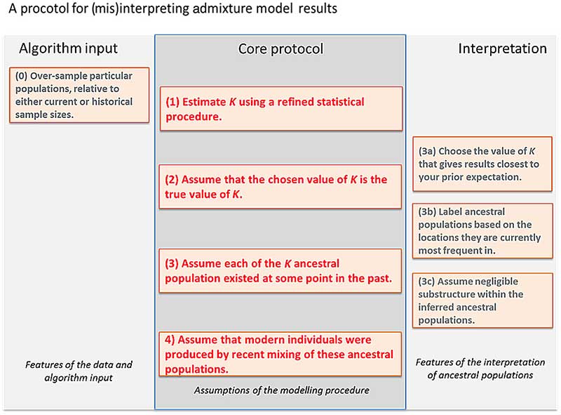
The default interpretation protocol
Most researchers are cautious but literal in their interpretation of STRUCTURE and ADMIXTURE results, as caricatured in Fig. 1, as it is difficult to interpret the results at all without making several of these assumptions. Here we use simulated and real data to illustrate how following this protocol can lead to inference of false histories, and how badMIXTURE can be used to examine model fit and avoid common pitfalls.
A protocol for interpreting admixture estimates, based on the assumption that the model underlying the inference is correct. If these assumptions are not validated, there is substantial danger of over-interpretation. The “Core protocol” describes the assumptions that are made by the admixture model itself (Protocol 1, 3, 4), and inference for estimating K (Protocol 2). The “Algorithm input” protocol describes choices that can further bias results, while the “Interpretation” protocol describes assumptions that can be made in interpreting the output that are not directly supported by model inference
Discussion
STRUCTURE and ADMIXTURE are popular because they give the user a broad-brush view of variation in genetic data, while allowing the possibility of zooming down on details about specific individuals or labelled groups. Unfortunately it is rarely the case that sampled data follows a simple history comprising a differentiation phase followed by a mixture phase, as assumed in an ADMIXTURE model and highlighted by case study 1. Naïve inferences based on this model (the Protocol of Fig. 1) can be misleading if sampling strategy or the inferred value of the number of populations K is inappropriate, or if recent bottlenecks or unobserved ancient structure appear in the data. It is therefore useful when interpreting the results obtained from real data to think of STRUCTURE and ADMIXTURE as algorithms that parsimoniously explain variation between individuals rather than as parametric models of divergence and admixture.
For example, if admixture events or genetic drift affect all members of the sample equally, then there is no variation between individuals for the model to explain. Non-African humans have a few percent Neanderthal ancestry, but this is invisible to STRUCTURE or ADMIXTURE since it does not result in differences in ancestry profiles between individuals. The same reasoning helps to explain why for most data sets—even in species such as humans where mixing is commonplace—each of the K populations is inferred by STRUCTURE/ADMIXTURE to have non-admixed representatives in the sample. If every individual in a group is in fact admixed, then (with some exceptions) the model simply shifts the allele frequencies of the inferred ancestral population to reflect the fraction of admixture that is shared by all individuals.
Several methods have been developed to estimate K, but for real data, the assumption that there is a true value is always incorrect; the question rather being whether the model is a good enough approximation to be practically useful. First, there may be close relatives in the sample which violates model assumptions. Second, there might be “isolation by distance”, meaning that there are no discrete populations at all. Third, population structure may be hierarchical, with subtle subdivisions nested within diverged groups. This kind of structure can be hard for the algorithms to detect and can lead to underestimation of K. Fourth, population structure may be fluid between historical epochs, with multiple events and structures leaving signals in the data. Many users examine the results of multiple K simultaneously but this makes interpretation more complex, especially because it makes it easier for users to find support for preconceptions about the data somewhere in the results.
In practice, the best that can be expected is that the algorithms choose the smallest number of ancestral populations that can explain the most salient variation in the data. Unless the demographic history of the sample is particularly simple, the value of K inferred according to any statistically sensible criterion is likely to be smaller than the number of distinct drift events that have practically impacted the sample. The algorithm uses variation in admixture proportions between individuals to approximately mimic the effect of more than K distinct drift events without estimating ancestral populations corresponding to each one. In other words, an admixture model is almost always “wrong” (Assumption 2 of the Core protocol, Fig. 1) and should not be interpreted without examining whether this lack of fit matters for a given question.
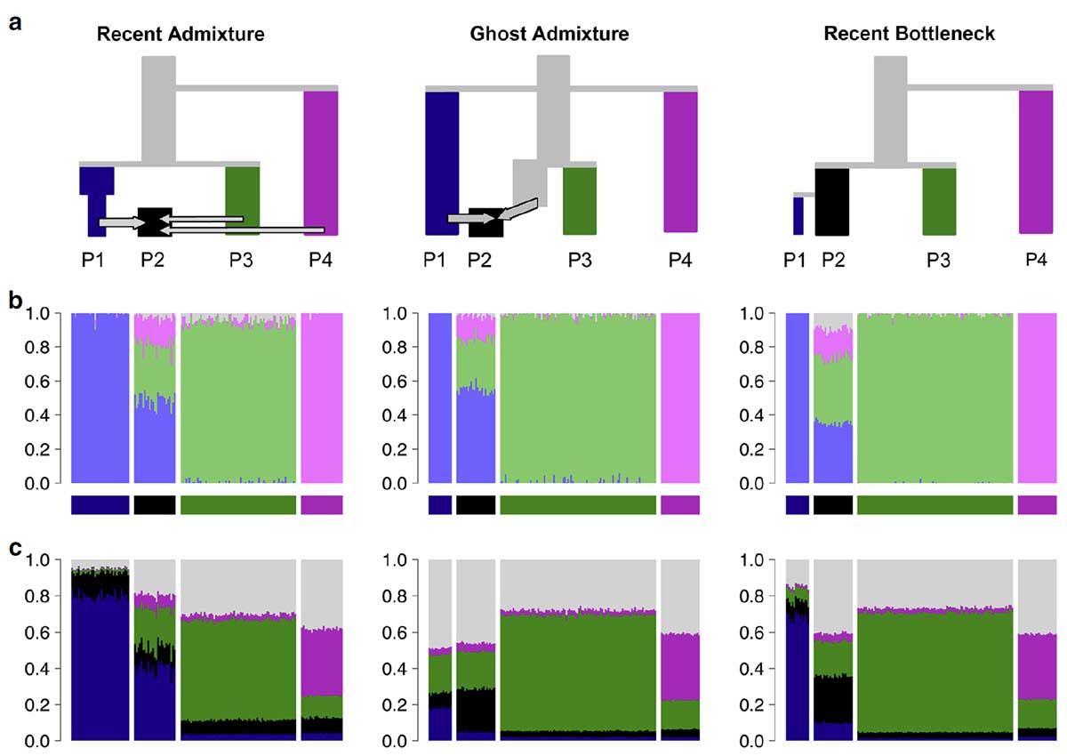
Three scenarios that give indistinguishable ADMIXTURE results. a Simplified schematic of each simulation scenario. b Inferred ADMIXTURE plots at K= 11. c CHROMOPAINTER inferred painting palettes.
Because STRUCTURE/ADMIXTURE accounts for the most salient variation, results are greatly affected by sample size in common with other methods. Specifically, groups that contain fewer samples or have undergone little population-specific drift of their own are likely to be fit as mixes of multiple drifted groups, rather than assigned to their own ancestral population. Indeed, if an ancient sample is put into a data set of modern individuals, the ancient sample is typically represented as an admixture of the modern populations (e.g., ref. 28,29), which can happen even if the individual sample is older than the split date of the modern populations and thus cannot be admixed.
This paper was already available as a preprint in bioRxiv (first published in 2016) and it is incredible that it needed to wait all this time to be published. I found it weird how reviewers focused on the “tone” of the paper. I think it is great to see files from the peer review process published, but we need to know who these reviewers were, to understand their whiny remarks… A lot of geneticists out there need to develop a thick skin, or else we are going to see more and more delays based on a perceived incorrect tone towards the field, which seems a rather subjective reason to force researchers to correct a paper.
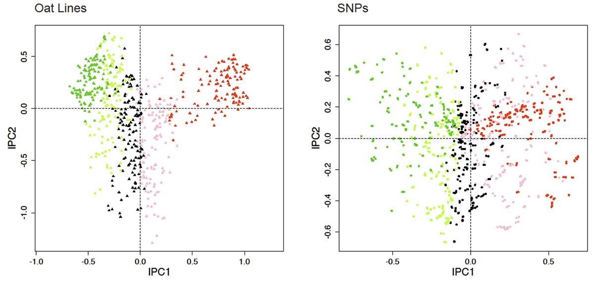
A potential hindrance to our advice to upgrade from PCA graphs to PCA biplots is that the SNPs are often so numerous that they would obscure the Items if both were graphed together. One way to reduce clutter, which is used in several figures in this article, is to present a biplot in two side-by-side panels, one for Items and one for SNPs. Another stratagem is to focus on a manageable subset of SNPs of particular interest and show only them in a biplot in order to avoid obscuring the Items. A later section on causal exploration by current methods mentions several procedures for identifying particularly relevant SNPs.
One of several data transformations is ordinarily applied to SNP data prior to PCA computations, such as centering by SNPs. These transformations make a huge difference in the appearance of PCA graphs or biplots. A SNPs-by-Items data matrix constitutes a two-way factorial design, so analysis of variance (ANOVA) recognizes three sources of variation: SNP main effects, Item main effects, and SNP-by-Item (S×I) interaction effects. Double-Centered PCA (DC-PCA) removes both main effects in order to focus on the remaining S×I interaction effects. The resulting PCs are called interaction principal components (IPCs), and are denoted by IPC1, IPC2, and so on. By way of preview, a later section on PCA variants argues that DC-PCA is best for SNP data. Surprisingly, our literature survey did not encounter even a single analysis identified as DC-PCA.
The axes in PCA graphs or biplots are often scaled to obtain a convenient shape, but actually the axes should have the same scale for many reasons emphasized recently by Malik and Piepho [3]. However, our literature survey found a correct ratio of 1 in only 10% of the articles, a slightly faulty ratio of the larger scale over the shorter scale within 1.1 in 12%, and a substantially faulty ratio above 2 in 16% with the worst cases being ratios of 31 and 44. Especially when the scale along one PCA axis is stretched by a factor of 2 or more relative to the other axis, the relationships among various points or clusters of points are distorted and easily misinterpreted. Also, 7% of the articles failed to show the scale on one or both PCA axes, which leaves readers with an impressionistic graph that cannot be reproduced without effort. The contemporary literature on PCA of SNP data mostly violates the prohibition against stretching axes.
DC-PCA biplot for oat data. The gradient in the CA-arranged matrix in Fig 13 is shown here for both lines and SNPs by the color scheme red, pink, black, light green, dark green.
The percentage of variation captured by each PC is often included in the axis labels of PCA graphs or biplots. In general this information is worth including, but there are two qualifications. First, these percentages need to be interpreted relative to the size of the data matrix because large datasets can capture a small percentage and yet still be effective. For example, for a large dataset with over 107,000 SNPs for over 6,000 persons, the first two components capture only 0.3693% and 0.117% of the variation, and yet the PCA graph shows clear structure (Fig 1A in [4]). Contrariwise, a PCA graph could capture a large percentage of the total variation, even 50% or more, but that would not guarantee that it will show evident structure in the data. Second, the interpretation of these percentages depends on exactly how the PCA analysis was conducted, as explained in a later section on PCA variants. Readers cannot meaningfully interpret the percentages of variation captured by PCA axes when authors fail to communicate which variant of PCA was used.
Conclusion
Five simple recommendations for effective PCA analysis of SNP data emerge from this investigation.
Use the SNP coding 1 for the rare or minor allele and 0 for the common or major allele.
Use DC-PCA; for any other PCA variant, examine its augmented ANOVA table.
Report which SNP coding and PCA variant were selected, as required by contemporary standards in science for transparency and reproducibility, so that readers can interpret PCA results properly and reproduce PCA analyses reliably.
Produce PCA biplots of both Items and SNPs, rather than merely PCA graphs of only Items, in order to display the joint structure of Items and SNPs and thereby to facilitate causal explanations. Be aware of the arch distortion when interpreting PCA graphs or biplots.
Produce PCA biplots and graphs that have the same scale on every axis.
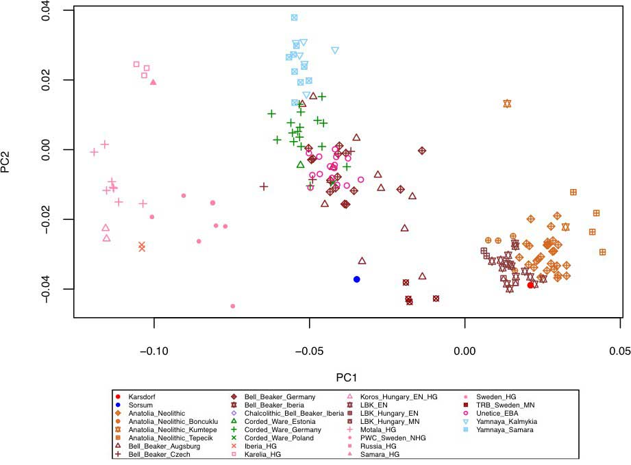
I read the referenced paper Biplots: Do Not Stretch Them!, by Malik and Piepho (2018), and even though it is not directly applicable to the most commonly available PCA graphs out there, it is a good reminder of the distorting effects of stretching. So for example quite recently in Krause-Kyora et al. (2018), where you can see Corded Ware and BBC samples from Central Europe clustering with samples from Yamna:
NOTE. This is related to a vertical distorsion (i.e. horizontal stretching), but possibly also to the addition of some distant outlier sample/s.
Principal Component Analysis (PCA) of the human Karsdorf and Sorsum samples together with previously published ancient populations projected on 27 modern day West Eurasian populations (not shown) based on a set of 1.23 million SNPs (Mathieson et al., 2015). https://doi.org/10.7554/eLife.36666.006
The so-called ‘Yamnaya’ ancestry
Every time I read papers like these, I remember commenters who kept swearing that genetics was the ultimate science that would solve anthropological problems, where unscientific archaeology and linguistics could not. Well, it seems that, like radiocarbon analysis, these promising developing methods need still a lot of refinement to achieve something meaningful, and that they mean nothing without traditional linguistics and archaeology… But we already knew that.
Also, if this is happening in most peer-reviewed publications, made by professional geneticists, in journals of high impact factor, you can only wonder how many more errors and misinterpretations can be found in the obscure market of so many amateur geneticists out there. Because amateur geneticist is a commonly used misnomer for people who are not geneticists (since they don’t have the most basic education in genetics), and some of them are not even ‘amateurs’ (because they are selling the outputs of bioinformatic tools)… It’s like calling healers ‘amateur doctors’.
NOTE. While everyone involved in population genetics is interested in knowing the truth, and we all have our confirmation (and other kinds of) biases, for those who get paid to tell people what they want to hear, and who have sold lots of wrong interpretations already, the incentives of ‘being right’ – and thus getting involved in crooked and paranoid behaviour regarding different interpretations – are as strong as the money they can win or loose by promoting themselves and selling more ‘product’.
As a reminder of how badly these wrong interpretations of genetic results – and the influence of the so-called ‘amateurs’ – can reflect on research groups, yet another turn of the screw by the Copenhagen group, in the oral presentations at Languages and migrations in pre-historic Europe (7-12 Aug 2018), organized by the Copenhagen University. The common theme seems to be that Bell Beaker and thus R1b-L23 subclades do represent a direct expansion from Yamna now, as opposed to being derived from Corded Ware migrants, as they supported before.
NOTE. Yes, the “Yamna → Corded Ware → Únětice / Bell Beaker” migration model is still commonplace in the Copenhagen workgroup. Yes, in 2018. Guus Kroonen had already admitted they were wrong, and it was already changed in the graphic representation accompanying a recent interview to Willerslev. However, since there is still no official retraction by anyone, it seems that each member has to reject the previous model in their own way, and at their own pace. I don’t think we can expect anyone at this point to accept responsibility for their wrong statements.
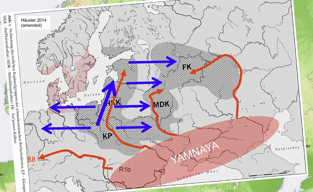
Kristiansen’s (2018) map of Indo-European migrations
I love the newly invented arrows of migration from Yamna to the north to distinguish among dialects attributed by them to CWC groups, and the intensive use of materials from Heyd’s publications in the presentation, which means they understand he was right – except for the fact that they are used to support a completely different theory, radically opposed to those defended in Heyd’s model…
Now added to the Copenhagen’s unending proposals of language expansions, some pearls from the oral presentation:
Corded Ware north of the Carpathians of R1a lineages developed Germanic;
R1b borugh [?] Italo-Celtic;
the increase in steppe ancestry on north European Bell Beakers mean that they “were a continuation of the Yamnaya/Corded Ware expansion”;
“Corded Ware groups [] stopped their expansion and took over the Bell Beaker package before migrating to England” [yep, it literally says that];
Italo-Celtic expanded to the UK and Iberia with Bell Beakers [I guess that included Lusitanian in Iberia, but not Messapian in Italy; or the opposite; or nothing like that, who knows];
2nd millennium BC Bronze Age Atlantic trade systems expanded Proto-Celtic [yep, trade systems expanded the language]
1st millennium BC expanded Gaulish with La Tène, including a “Gaulish version of Celtic to Ireland/UK” [hmmm, datBritish Gaulish indeed].
You know, because, why the hell not? A logical, stable, consequential, no-nonsense approach to Indo-European migrations, as always.
Also, compare still more invented arrows of migrations, from Mikkel Nørtoft’s Introducing the Homeland Timeline Map, going against Kristiansen’s multiple arrows, and even against the own recent fantasy map series in showing Bell Beakers stem from Yamna instead of CWC (or not, you never truly know what arrows actually mean):
Nørtoft’s (2018) maps of Indo-European migrations.
I really, really loved that perennial arrow of migration from Volosovo, ca. 4000-800 BC (3000+ years, no less!), representing Uralic?, like that, without specifics – which is like saying, “somebody from the eastern forest zone, somehow, at some time, expanded something that was not Indo-European to Finland, and we couldn’t care less, except for the fact that they were certainly not R1a“.
This and Kristiansen’s arrows are the most comical invented migration routes of 2018; and that is saying something, given the dozens of similar maps that people publish in forums and blogs each week.
NOTE. You can read a more reasonable account of how haplogroup R1b-L51 and how R1-Z645 subclades expanded, and which dialects most likely expanded with them.
We don’t know where these scholars of the Danish workgroup stand at this moment, or if they ever had (or intended to have) a common position – beyond their persistent ideas of Yamnaya™ ancestral component = Indo-European and R1a must be Indo-European – , because each new publication changes some essential aspects without expressly stating so, and makes thus everything still messier.
It’s hard to accept that this is a series of presentations made by professional linguists, archaeologists, and geneticists, as stated by the official website, and still harder to imagine that they collaborate within the same professional workgroup, which includes experienced geneticists and academics.
I propose the following video to close future presentations introducing innovative ideas like those above, to help the audience find the appropriate mood:
It is good practice to be registered
and logged in to comment.
Please keep the discussion of this post on topic. Civilized discussion. Academic tone.
For other topics, use the forums instead.