The last few weeks have been very exciting in terms the amount, diversity and quality of newly reported ancient samples, which included new genotypes and also Y-DNA and mtDNA haplogroups.
As some of you already know, I had been preparing a tailored GIS map of ancient DNA using QGIS-server on Ubuntu and trying some of the available plugins for the task, and was ready to use my old broken PC as a web server. For that, I needed to prepare different files corresponding to the different conventional divisions of the Prehistory Atlas. The crazy number of recently reported papers and samples, which might have compelled me to create a number of files every single time, makes that task exasperating and basically impossible whenever I don’t have much time.
In the end, I have to admit that paying for an external GIS server is the best idea to save time (which is also money), so I decided to try ArcGIS Online.
NOTE. You can use an easier to remember domain name haplogroup.info to access both, this ArcGIS Online map and the Google Drive folder with the dataset.
The information that follows is tailored towards the use of Maps for creation of visualization and graphics, rather than the more straightforward Web App, but both are based on the same map layers.
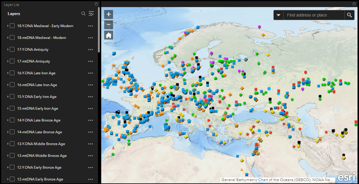
Ancient Y-DNA and mtDNA
The main advantage of this online system for me is that I only need to update the files, and all dependent sections are updated automatically. The main disadvantage is that it lacks the flexibility in creating views that other systems offer.
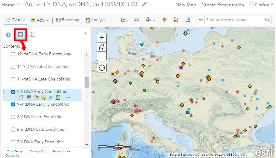
The following are some instructions for use and common options for users. To access the different available layers, be sure to select “Show Contents of Map” with the button surrounded in a red square in the image below (the default view will usually correspond to one of the other two buttons, i.e. “Legend” or “Information”):
Standard locations
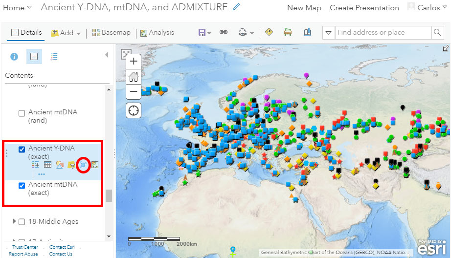
The default visualization includes a physical basemap without labels (it can be changed) and the Y-DNA layer called “Ancient Y-DNA (exact)”, just above the “Ancient mtDNA (exact)” layer, both displaying (precise) locations of samples as reported in the papers, or official latitude & longitude values of the archaeological site:
Multiple samples
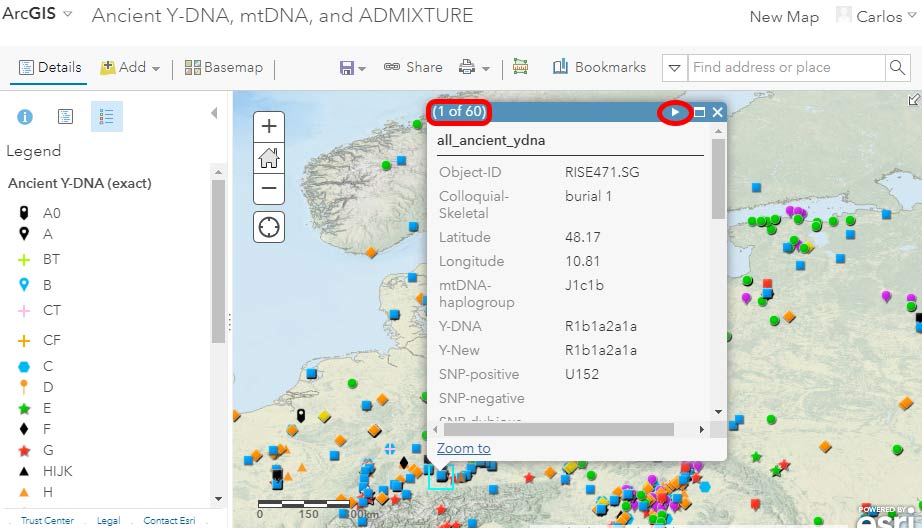
When more than one sample overlaps in the same location – and that depends on the zoom level you are at – you will notice that clicking on it to get more information displays on the top left part of the pop-up (red rectangle in the image below) the number of samples available. The arrows on the top right corner (in red circle below) help you navigate through the available samples:
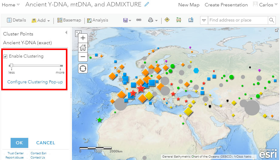
Cluster Points
Potentially useful tools to better appreciate overlapping samples are cluster points and clustering pop-ups. Notice in the image above the red circle surrounding the button “Cluster Points” to get to the following menu:
Randomized location
For a quick visual of haplogroups, such as when presenting data in simple graphics, I find a (controlled) randomized distribution of latitude & longitude values better than a standard or clustered visualization. For that, you have the option of selecting the “Ancient Y-DNA (rand)” and “Ancient mtDNA (rand)” layers, including minor (random) changes to the reported latitude & longitude values:
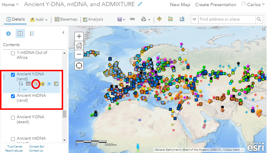
All filtered data by age (see below), as well as data with labels, are based on the files with randomized locations.
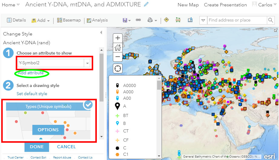
Change Style
As you can see, the number of different haplogroup symbols and colors increases when using the layer with randomized locations. I did this because the use of clustering is almost obligatory with exact locations, whereas using randomized ones allows you to have many more symbols next to each other in the same graphic.
Notice in the image above the red circle surrounding the button “Change Style” to get to the following menu, where you can select (1) the attribute or attributes and (2) the corresponding symbols (including shape, size, border, color, transparency, etc.):
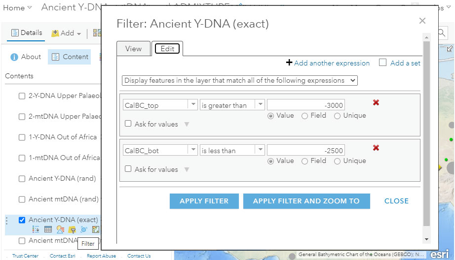
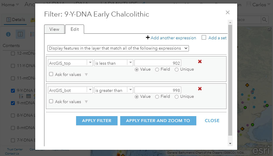
Filter by date
The most obvious fields to select to obtain a filter would be the reported dates, which in the dataset are numerical values of the fields “CalBC_top” and “CalBC_bot” (“bot” stands for bottom), represented as (-) for (cal)BC, and (+) for (cal)AD. For example, in the setting below we could try and include all samples from ca. 3000 BC to 2500 BC, i.e. -3000 to -2500:
Filter by period
The problem with the simplest filters is that they invariably award samples with wide confidence intervals (i.e. those less precisely dated), and don’t consider specifically reported cultures or likely periods. For example, a British or Sicilian Bell Beaker reported as ca. 2800-1800 BC will appear in any filter including those periods, while the most likely date for both is ca. 2500-2200 BC (and most likely late within that interval).
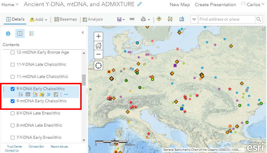
The idea of using periods instead of dates is that we should be able to obtain a map of roughly coeval cultures and samples, like this one below for “Early Chalcolithic” (ca. 3300-2600 BC):
With that aim in mind I added the fields for QGIS and ArcGIS simplified dates in the Ancient DNA Dataset. The notation of the available “ArcGIS_top” and “ArcGIS_bot” was planned mainly for the timeline tool of the offline ArcMap software, which isn’t very flexible for archaeological dates.
The numbers selected run in the hundreds, which correspond roughly to the number of the culture map (e.g. 8-Early Eneolithic corresponds to the period 801-899) until the Late Chalcolithic and following maps, where they correspond to one digit less (11-Late Chalcolithic to 1001-1099):
NOTE. The numbers above 900 don’t fit yet because I haven’t used a planned map between the “Early Chalcolithic” and “Late Chalcolithic” periods, to distinguish between Final Eneolithic / Bronze Age groups, such as Late Repin / Trypillia / Yamnaya / Corded Ware / Early Bell Beaker interactions, that would correspond to a number 10. Numbers will fit when I add that map to the whole batch, and shift numbers one digit up – hopefully when Eneolithic and Chalcolithic data get published and I can fill up those maps with samples and cultural groups…
You have all examples already available for each conventional period, to copy and paste the filter if necessary.
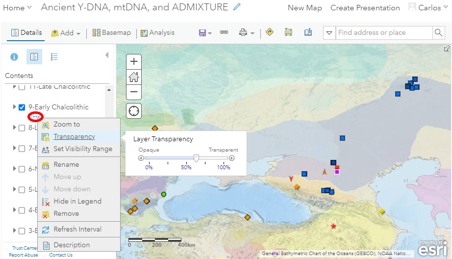
Culture background
If you want to use a cultural background to accompany your filtered data, you can select at the bottom of the available layers – below datasets and above the basemap – one of the semi-transparent KML layers corresponding to the conventional periods of the Prehistory Atlas. In the case below, I selected the Y-DNA data of the “Early Chalcolithic” period, and the corresponding cultural map, whose transparency values I can then adjust (link with three dots, surrounded by a red circle in the image below):
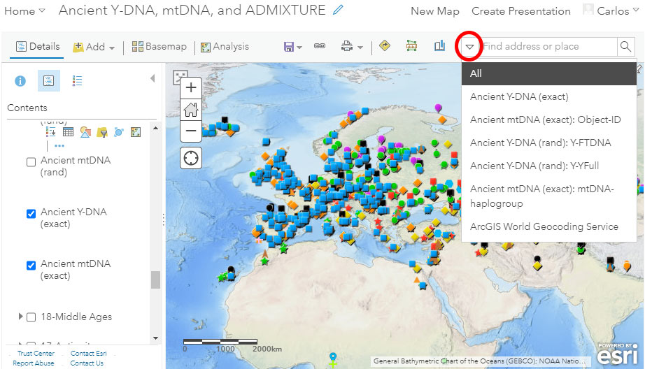
Search
ArcGIS Online also offers the possibility for quick search. While the default option looks for places or locations, you can select from the dropdown menu to look for specific fields, including sample names (Object-ID, usually unique). You can also look for Y-DNA (FTDNA or YFull nomenclature) or mtDNA haplogroups, but since many reported subclades are not unique, the search result might not be what you are looking for.
ADMIXTURE
Given that preparing a file with ADMIXTURE values takes much more time than updating the dataset in Excel, I hope to be able to prepare an updated spreadsheet with a (likely unsupervised) run of K=7 or K=8 and add it to the online map as another layer, once the latest genotype data from Brunel et al. (2020) gets published.
I will probably also divide the ADMIXTURE file into conventional periods for ease of use.
If you have any suggestion for improvement, feel free to comment below.