New preprint at BioRxiv, Genetic landscapes reveal how human genetic diversity aligns with geography, by Peter, Petkova, and Novembre (2017).
Abstract:
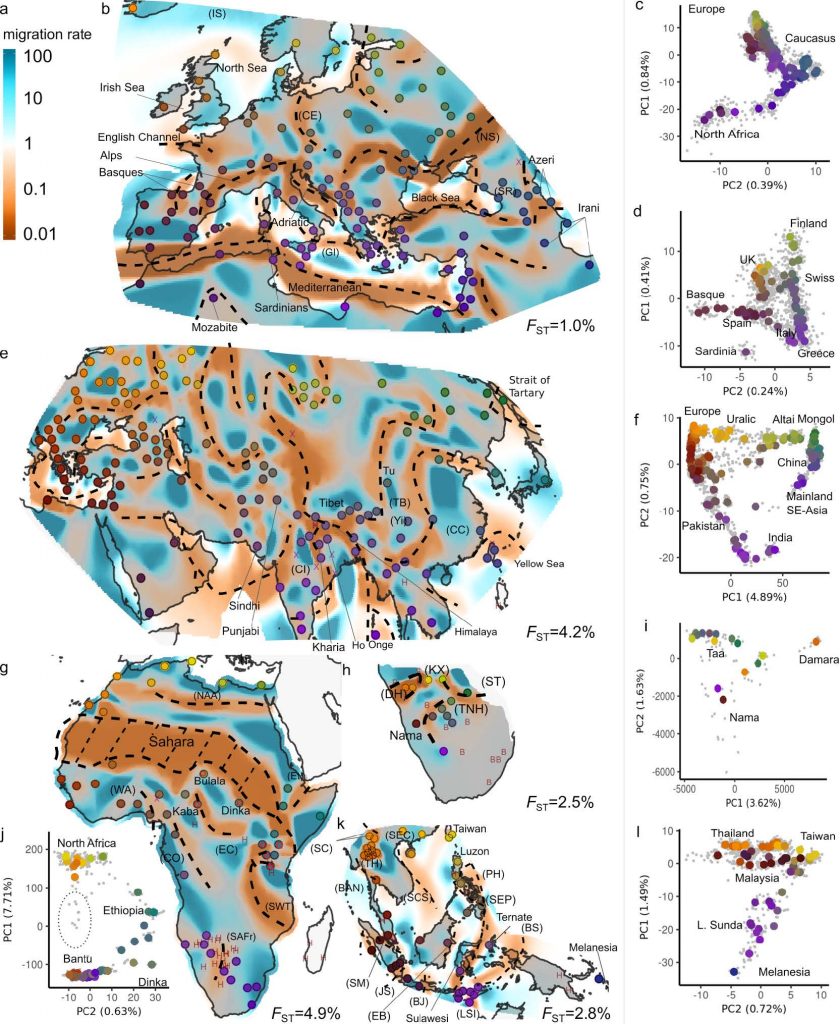
Summarizing spatial patterns in human genetic diversity to understand population history has been a persistent goal for human geneticists. Here, we use a recently developed spatially explicit method to estimate “effective migration” surfaces to visualize how human genetic diversity is geographically structured (the EEMS method). The resulting surfaces are “rugged”, which indicates the relationship between genetic and geographic distance is heterogenous and distorted as a rule. Most prominently, topographic and marine features regularly align with increased genetic differentiation (e.g. the Sahara desert, Mediterranean Sea or Himalaya at large scales; the Adriatic, inter-island straits in near Oceania at smaller scales). We also see traces of historical migrations and boundaries of language families. These results provide visualizations of human genetic diversity that reveal local patterns of differentiation in detail and emphasize that while genetic similarity generally decays with geographic distance, there have regularly been factors that subtly distort the underlying relationship across space observed today. The fine-scale population structure depicted here is relevant to understanding complex processes of human population history and may provide insights for geographic patterning in rare variants and heritable disease risk.

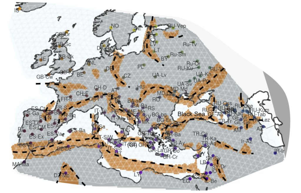
Among ‘effective migration surfaces‘ (or potential past migration routes), the Pontic-Caspian steppe and its most direct connection with the Carpathian basin, the Danubian plains, appear maybe paradoxically as a constant ‘trough’ (below average migration rate) in all maps.
After all, we could have agreed that this region should be a priori thought as the route of many migrations from the steppe and Asia into Central Europe (and thus of ‘effective migration’) in prehistoric, proto-historic and historic times, such as Suvorovo-Novodanilovka (Pre-Anatolian), Yamna (Late Indo-European), probably Srubna, Scythian-Cimmerian, Sarmatian, Huns, Goths, Avars, Slavs, Mongols…
It most likely (at least partially) represents a rather recent historical barrier to admixture, involving successive Byzantine, South Slavic, and Ottoman spheres of influence positioned against Balto-Slavic societies of Eastern Europe.

Featured image, from the article: “Large-scale patterns of population structure. a: EEMS posterior mean effective migration surface for Afro-Eurasia (AEA) panel. ‘X’ marks locations of samples excluded as displaced or recently admixed. ‘H marks locations of excluded hunter-gatherer populations. Regions and features discussed in the main text are labeled. Approximate locations of troughs are annotated with dashed lines (see Extended Data Figure 4). b: PCA plot of AEA panel: Individuals are displayed as grey dots, colored dots reflect median of sample locations; with colors reflecting geography and matching with the EEMS plot. Locations displayed in the EEMS plot reflect the position of populations after alignment to grid vertices used in the model (see methods).”
Images and text available under a CC-BY-NC-ND 4.0 International License.
Discovered via Razib Khan’s blog.
Related:
- Effective migration in Western Eurasia reveals fine-scale migration surface features
- Migrations painted by Irish and Scottish genetic clusters, and their relationship with British and European ones
- New preprint papers on Finland’s population history and disease, skin pigmentation in Africa, and genetic variation in Thailand hunter-gatherers
- Islands across the Indonesian archipelago show complex patterns of admixture